

nonono
-
Posts
10 -
Joined
-
Last visited
Content Type
Profiles
Forums
Events
Posts posted by nonono
-
-
Yes, buttons with words on are great the first time you use a program but after that it's info you really don't need and you'll probably wish there was more room for other stuff.
I can tell you right now that I won't be changing my little icons, I like them

A real response, great! I think the room for other stuff is not a good argument for using tiny icons. ImgBurn could use my whole screen if it would make using the program more intuitive and easy to use. Some of the icons are really hard to interpret, for example the load / eject icons. Consider a dynamic linklabel ('load' / 'eject' based on the state of the disk drive), wouldn't you think that is more obvious? Also the wide screen mode, why is it necessary? Isn't it a basic function of the program to select and manage the files you want to burn to your disk? Why not make the input window wider and remove the 'large screen' mode?
From experience (and the other user as well), I can tell you that the erase disk feature is very hiden (it's hard to identify the icon). If the user inserts a rewritable media in their disk drive, why not display the following text above the Source section: "Warning: The disk will automatically be formatted before burn." (+ an optional linklabel to show the content of the disk in windows explorer). It would make the erase icon obsolete. The Display Graph Data using DVDInfoPro is really an advanced option and should be in the menu bar only I would say.
This would already strip 5 icons from the interface and improve it a great deal.
-
I think you are missing donta's point, he wasn't taking the piss but rather asking how you got to where you are now as in what was your learning process with computers. I doubt he was suggesting you learned to drive at Sears. When has anyone said you were hostile? You just seem to persist even after you've been give your answer.
The reason I 'persist' is that I'm participating in a discussion; a discussion about the merits of my proposals. I would think this discussion has merit as it can only improve feedback to the developer of ImgBurn. Instead of others discussing the actual proposals, a lot of comments (here and in the other topic) claim that this is not what 'others' want and that I'm just making suggestions for my own benefit. If so, you could at least say WHY my suggestions would not benefit the average user and actualy discuss the items.
I percieved the attitude of some as hostile as they do not want to participate in discussion. They merely state that my proposals have no merit (without real argumentation) and then think I should bugger off (as do you).
-
Where did you how did you learn to use a computer ?
I don't understand why you view my constructive critisism as hostile. For example, wouldn't you agree that a simple button with the text 'Add file' is easier and more intuitive than the tiny icons on the ImgBurn interface? I can't know the meaning of a specific icon without hovering over that icon. If I'm looking for a certain function (say erase a disk), I'll have to go over each icon until I find the one I'm looking for. If I can just scan the interface and click the button 'Erase disk', that would be a lot easier.
-
Mmmm I suspect your forum name sums up a lot of feelings in the forum here today

You seem to be quite obsessed with the Erase function, you do know (as the boss has already said) that the program will erase RW discs when the user starts the program ? Why have a button for something that is automatic......
I realise you want to tailor the program to your requirements but you have to remember that thousands of users don't require these changes, they are not requesting them, many have grown up with ImgBurn's predecessor and also ImgBurn and won't feel these changes are needed......
In the end of course it's Lightning UK!'s program and whilst constructive comments are welcomed you have to understand that sometimes the answers will be 'no'.
Regards
I think pdavid's topic contains the same points as the topic I opened a few days ago. The reason I think the user interface should be simplified is because a lot of tasks aren't obvious without learning them. How should I have known that the disk will be erased before I burn my file compilation? I guess I should have read the guide; but should users really have to read a guide to use and understand such a simple program as ImgBurn?
I think Lightning UK! is an excellent programmer, with the right programmer mindset. However, the programmer mindset effects the interface design in many ways. For example, the Build, Write, etc modes; I can only guess that the program internally is separated in these components. Such a separation on the interface level doesn't make that much sense however, as users look at the goal to achieve and the steps needed. From a users point of view it doesn't make any sense that they can switch from 'write files to disk' to 'write files to image' with the click of a button. While this is probably there because both modes share the same input and the output format can be easily changed. Another example is the use of tiny icons with tooltips for each action. A new user does not know what each button does. While an experienced user builds up an image / action association list, new users have to learn this before they can use the program. A simple button named 'Add File' is a lot clearer than a tiny icon with a file depicted. I can only guess that the author chose to use tiny icons because he associates it with an efficient layout; this might not be the case as I stated above.
Please don't interpret my comments on ImgBurn as a flame of some sort. I'm just being a bit critical as constructive critisism can help improve the program. It's not a bad thing to let someone who has no experience with the interface take a look and see if the interface is really that obvious. If you are a long time user it's often hard to see how the interface can improve, as you are used to the current layout. My offer to lighting UK for feedback on a future program GUI still stands, but only if he values it.
-
'Ez-Mode Picker' is exactly what it says, it's an easy way for the (less clued up) user to pick the correct 'Mode'.
There is no 'Erase' mode, hence why it's not on the Ez-Mode Picker screen.
There isn't an active drive when you're on the Ez-Mode Picker screen, hence why 'Erase' isn't (and all the other drive related options aren't) available.
Audio support comes from CUE file support, there is no 'Mode' for making an audio disc... in time that'll no doubt change but I wanted to keep things as simple for me as possible until I was happy with how the internal code was working.
Creating an audio disc is a 2 part process. First you must create a CUE file, then you load the CUE file in Write mode. So everything is just fine as it is.
Actually, its a two part process for the program, it should not be for the user. The interface should be designed from a user's point of view, not the developers. The user views task as the goal to achieve and the steps needed to achieve that goal. For example; Make an audio disk from compressed audio files. Steps to achieve this: select the compressed audio files, select the drive and click the burn button. I'm willing to help out if you need help reviewing the interface for future version, just send me an email.
-
I don't want to push anything if it seems to appear that way. These were just suggestions that I hope will be implemented. I'll leave it alone now and look forward to future versions. Keep up the good work LUK. Cheers.
-
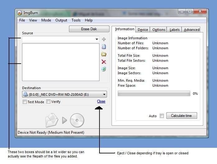
See image attached, looks a lot cleaner and you can just work from top to bottom.

-
1) there's an option in the settings (Build tab) that allows you to always use the default suggested name, and although this is what works for you, it isn't the best option for most people.
2) when there wasn't icons/buttons people complained that they had to dig in the menus to find what they wanted, again it's down to what you like not being what most people prefer.
3) not even a slight chance of happening, since a program that doesn't stick to its original name always loses users in the transition. This could be said from DVD Decrypter, whose burn engine was made batter and turned into ImgBurn, yet a lot of people still use the former program for burning. Some people (you can see many thread in this very forum about this) don't even bother to update ImgBurn purely because they think the newer version has no improvements and/or is different from the old version (/myrant)
Please notice that these are my own opinions and may not reflect the author's opinions, which will be expressed in due time
So what target group is ImgBurn aimed at? The program is simple in design, allows users to perform basic CD / DVD burning task and is intuitive to use. I would think the program is aimed at the general computer user. The general computer user usually wants to accomplish their tasks with as little burdon as possible, no excess options or popup boxes (put these in advanced settings and set the defaults right). My comments basically related to that. I've never seen anybody care about the dvd volume title. All the little icons are also difficult to understand without hovering over them to understand the meaning. You'll get used to it, but why should new users have to learn? Even I as advanced computer user overlooked the tiny erase disk icon. However, if there is a RW disk in the drive, that is likely the first step I would like to perform in the 'write files to disk' window (should thus be placed at the top left of the window, above 'source'). And I don't know why Display Graph Data using DVDInfoPro would be an often used option.
About a new name; If you put a place holder text on the old website with 'ImgBurn is now called ....Burn' and redirect after 5 sec to the new site, you aren't going to lose any users. The site and community will stay the same, just a new name.
edit: The burn files to disk window for example has a left and right panel. I would keep the left panel as basic as possible; easy to understand, intuitive to use (e.g. erase disk before selecting new files) and clutter free. The right panel contains all the advanced settings, with everything set correct by default (like the disk name). These can be editted if needed, but don't have to be as the defaults are correct. Make the left panel bigger (so you can actually see the filepath of the files you selected) and the window is perfect.
-
Hello, first I would like to say that I just love your program. Second, let me provide you some feedback that you may find useful:
1. When selecting the burn button (Burn files to disk), the program prompts me for the disk / volume name (omitted by default). If users omit the volume name, I think it's safe to assume the user is ok with a default name; no need to prompt.
2. The interface can be very cluttered. For example, the burn files to disk window has a lot of small icons. Some useful, some not really needed (can be in the menu bar). The useful ones should be bigger and more obvious; e.g. I didn't notice the erase disk icon ( I had to find it burried 3 deep in the menu bar ). Others could go; e.g. switch to large size window (why not allow me to resize the window and automatically remember the size for next time), switch to image file output (I would have chosen the other option in the main menu), Display Graph data using ... (?). Also, plain text like 'Eject', 'Load', 'Add', 'Delete', etc. is often much easier to understand than the icons. I had to hover over each icon to understand its meaning. The same applied to the image burn window. By default the main box where the files and folders are listed should be bigger as well. --> This is just a rant from someone who isn't familiar with the program and might help improve understanding and using the application for new users.
3. Last but not least; change the name of the program to something more general. I had always known imgburn, but I always thought it only allowed burning image files (hence the name). Only after a friend showed that imgburn also allows you to burn files / folders; I instantly dumped all other burning software. The name of the program is very important to convey its meaning, the current one doesn't apply anymore.
Cheers.

The road to version 3 of ImgBurn
in ImgBurn Suggestions
Posted
I'm sorry, but this is yet another evasion of discussion. If you tell me "You just seem to persist even after you've been give your answer.", I interpret that as that you think discussion is closed after someone has 'countered' my arguments. Even if Lightning UK states that he won't implement a certain proposal, it can still be beneficial to discuss something further. He could change his mind based on the ARGUMENTS used in the discussion, or keep the discussion in mind when he feels the need to introduce tiny icons in the future. He could even participate in the discussion himself and convince me or be convinced. There is no harm in discussing something, I don't understand why you think it's bad if I persist trying to discuss these items.